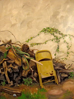
This is a quick Plien Air painting I knocked out this afternoon as the sun passed over the garage throwing it into shadow. I had a hunger to paint today, I just felt restless, though I am only so-so with the results of this effort. But i couldn't resist. And i figured why not paint something right here and keep the set-up/clean-up simple. I will go back and probably tickle it a bit up once it's dry, finish things like the hose the. I hadn't painted anything since Feb, when I submitted to PAFA. The photo's colors are a bit off, it seems too yellow here.
3 comments:
Mike,
I'm being very tactful here. Overall, I admire your work for Draw magazine, and have been a fan of your blog for many months.
So what I'm about to comment on may be stepping on too many toes - if so, I apologise in advance.
I'm looking at your 'backyard plein air' painting and realise, from your comments, that it is still a work in progress [and the picture cast is a little too yellow]. Seeing a picture thus is always difficult, but for somebody who shows such vivid spatial awareness when drawing comic images [or sketching outside]
this work appears very 'flat'. Also part of the problem is the compositional structure. Now you may say your intent was to record the scene as it was. But occasionally a painting derives so much more from a little judicious 'tweaking'. For example,
the negative space of the top could benifit from something being added to the left area of the wall, something that picks up the colours of your woodpile but acts as a 'balance' to the main mass, and at the same time the log in the left foreground could [after reversing] be moved to the right foreground, again purely for balance.
Suggestions - respectively yours, Russ
Very nice capture!!It's vivid.
Good points Russell and I think some of them are addressed in the final version here. Like I said the painting wasn't finished as the light changed so much I had to stop. This morning I went back and worked on it again. I agree, sometimes we can take artistic liscense, it's up the the artist to decide how much they want to take, I don't want to move the wood, things like that as I want to record the scene as is. I did tweak things to be sure, eliminated small details and such.
The light was very flat, very grey and that was the the challenge to get depth in a low light range, I think it works better now---maybe you won't agree, which is fine :-)
Harlequin, thanks for the nice words.
Post a Comment